
How to make a good page for a Charity?
Too often nonprofits see their donation page as a simple job that they have to tick off their list. They know they need one, but they see it more as a Yellow Pages mention than it could be: a window into the soul of the organization. Your website is one of the most important ways the public communicates with you.
Having a donation page for your nonprofit organization is crucial to the success of your organization. It is not only where donors go when they want to know more about their case, but also where supporters need to be encouraged to contribute.

Table of Contents
How to create a donation website?
How to make a donation page?
Top 6 techniques to make a great donation page:
1. Simplify your donation process
2. Optimize your donate money page and donation form for mobile devices
3. Problem, solution, impact
4. Prioritize the 'About' page us'
5. Use video
6. Make it easy to recruit volunteers
Conclusion
How to create a donation website?
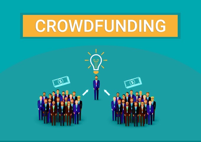
If you've decided to jump into the world of crowdfunding, you're probably wondering where to start. The first? You'll need to learn how to create an inspiring donation page that will attract people's generosity. Whether you need help for a disease victim or educational expenses (among many others). No matter the reason, it's essential that you know how to set up a donation page so that it is compelling and tells a unique story.
Make sure your website is designed in a way that appeals to the needs of potential donors and therefore maximizes your fundraising potential.
Your website design can directly influence your online fundraising. Numerous studies have shown that the layout of the donate page can influence whether or not it leads to conversions (eg, someone making a donation).
To be highly effective, a nonprofit page doesn't have to be complex or expensive. We've collected a number of design features that every donated money page should have, followed by some examples.
How to make a donation page?
Top 6 techniques for making a great donation page:
1. Simplify your donation process
Fundraising is at the heart of every nonprofit, so makes it easy for people who donate online. By following some of these simple guidelines, you'll probably also increase the amount you can collect through your donate page:
Make sure your donation page and form are easy to find.
A good rule of thumb for this is: to try to keep your supporters, no matter where they are on your page, just one click away from your donation form. This means that you must have a donation button in your main navigation menu. Set it apart from the rest of the menu with a striking color. The donation link should lead directly to the donation page and form.
A common mistake is adding extra steps or more text after someone clicks the donate button. Although the intention is usually good, such as informing donors of other ways to participate, these extra steps can reduce the likelihood that someone will actually donate.
Provide a convincing “why”.
Your donation page shouldn't feel like just a payment processing form. Instead, briefly remind people why they have decided to give money to your organization.
Use the appropriate online fundraising software for your page to donate money.
Online fundraising software makes creating your donation site much easier and also offers a number of features such as:
Amounts are entered in advance with descriptions. This lets donors know what they are contributing.
Integrated employee donation matching.
Recurring options to be able to donate. Place a recurring option on your donation form to see higher donor retention rates.
A donation 'thermometer' to encourage more donations.
PDF invoices and other features with which you can collect more money.
Artsen zonder Grenzen simplifies your donation process by ensuring that visitors, once there, also stay on your donation page.
The more distractions there are on the donation page, the lower the conversion rate. Here's a way to keep the donation process solely on task, that is to convert the page visitor to a donor:
Hide the standard top browser in the donation page header.
Use a simple footer design.
Delete unnecessary links.
Hide icons for social networks.
Be thrifty with text.
.
2. Optimize your donate page and donation form for mobile devices
Your website and donation form should be mobile-friendly. This means that for an optimal display of the website format, the pages must be adapted to the device to be used.
Our smartphones are becoming the most popular way to connect, share, find information, and donate. We, therefore, expect optimized pages when donating.
We learned from NP Source
that in 2018 mobile devices accounted for 57% of all internet traffic. The number of mobile donations has increased by 205% in the last year. 51% of people who visit a nonprofit website do so on a mobile device.
To make your website mobile-friendly, you should avoid using large photos where donors have to swipe to get up-to-date information. Your text should be large enough to read on small devices. Not sure if your site is mobile-friendly? Take your phone and check it out!
Good navigation is also an important part of mobile-friendly websites. When viewing websites on mobile phones, there isn't much room for drop-down menus or complicated content-heavy navigation. Simplify your mobile browsing so only essential information is available.
NP Source also found that nonprofits can increase their donations by an average of 126% by including a mobile responsive design. If a visitor gets frustrated when they make an attempt to donate to your organization on their mobile device, chances are they will leave your site without making a donation.
3. Problem, Solution, Impact
If you think of donating as a purchasing decision, your website must be able to answer questions and counter possible objections in the spirit of the donor.
Why should I donate?
Why should I donate to you instead of another organization?
How do I know if my money will be used wisely and ethically?
When you start using content to build your website, you start with the problem to solve, how it solves it, and why it matters to the site visitor. The awareness process for scrolling down a page on your website goes something like this: awareness of the problem, the solution to the problem, and the motivation to be part of the solution.
You should follow the 'problem' with your organization's explicit solution to that problem. Then go to the immediate impact of your organization. Prove the effectiveness of your solution by demonstrating impact with stunning visuals. Did you know that the brain processes images 60,000 times faster than text! Your content is much more attractive and attractive if you ensure that it has the following:
Photographic images,
Images or infographics with statistics, data, or processes,
Videos and vlogs.
Donors want to know that their hard-earned money is going to a charity. They want to know what your organization will do with the money. Transparency means being open and accountable to the donor. It means being trustworthy and doing what is promised.
People can only donate if they see examples or proof on your website that their donations will also be used appropriately. Some donors can search for your organization on sites like CharityNavigator, but it saves them time and worries if your page provides specific information. This can be statistics, reports from the field, or financial data, so donors have a degree of confidence in your organization.
On its home page, Heifer International has a course that combines transparency and accountability statistics with a call to action. They have added donation buttons with different amounts to donate.
Heifer also has share buttons on each page, donors know they can share the page on their Twitter or Facebook.
Charity: Water speaks highly of the impact of their work on their Project page.
They also have a separate section with supporting financial information for potential donors to support the requirements.
4. Prioritize the 'About Us' Page
When potential donors or volunteers view services on your website, the 'About Us' page is probably in their first 3-4 clicks. They want to ensure that when supporting their organization they are also making a good choice. Don't make it a separate issue. Understand what this page is for. Even if your nonprofit has great results to highlight on the website, people need to be able to tell who you are. That's what this page is about. Think of it like a "first date." It's about getting to know each other, building rapport, and making a lasting impression.
Unfortunately, the About Us page can become a dumping ground for a lot of things. So try not to cram everything on this page. Your annual report, financial data, mission statement, team life descriptions, and company history can all earn their own place on a separate page on the website. By ensuring that these things don't make it onto the page, you can also ensure that they don't override your own interests. Make sure this page only showcases your nonprofit's personality and values.
Make the page about who you are in the strictest sense:
Who does your charity want to help? Are you raising money for ecological/planetary issues, human rights, and animal welfare? Be clear about what or for what you collect money.
What it does: Every organization has a story. What inspired you to start?
Why you do it: Provide details about projects you've worked on in the past and let donors know what you're doing and what you have planned for the future.
Think high-level and stick to the highlights. This is really an opportunity to emphasize what you're doing on a memorable and meaningful page.
You may notice that some organizations frame the About Us section slightly differently. Some call it “Our story”, “Who we are” or simply “Learn more about us”. They all have the same intention: to find out what it is.
Don't ignore the impact of visual stories and the ability to present your nonprofit's story in a more compelling way. Although the good text on your About Us page is still essential, the role is sometimes just supportive and contextual for photos, images, or videos.
Long content doesn't always translate into lasting impressions. If you're thinking of writing an About Us page, avoid the long version of your story.
Stay with the elevator pitch, but in written form. That is, write content as if you had to sell your organization in the time people need to take the elevator up and down the building. Be convincing and cite all the key points that make your nonprofit great and different. Keep your content engaging but concise.
The Nature Conservancy does them About Us very well. They call it “Who we are”. A three-minute video tells her story and provides fascinating statistics on the scope of her work. Think of a Show and Tell. It is not one or the other. Consider refreshing you're About Us page by adding some photos, images, or videos.
5. Use video
How successful a fundraiser depends on the donors. It's not so much about teaching people something but making contact with people. That's why it's so important to include a video on your donation site. With videos, to build a bond with your audience, you can combine your story with emotion that words and photos simply can't.
Video offers incredible opportunities for your nonprofit organization to recruit supporters, engage them in your work, and help raise funds. Video can help your audience visualize why you exist, move them to feel real emotion, and motivate them to care, share, and take action.
Online, video reigns supreme. In terms of likes, shares, downloads, and donations, video consistently outperforms all other forms of digital communication.
A 60-second nonprofit fundraising video has the same effect as 1.8 million words or 3,600 pages of text, but the raw emotion captured is what matters! Here are some other video stats nonprofits should be aware of:
Video this year accounts for 69% of all internet traffic for consumers, with it predicted to grow even more in the coming years.
Video content is responsible for 85% of all internet traffic.
57% of online donors donate after watching an inspirational fundraising video.
Video promoted fundraising pages generate four times the amount of donations.
More than half of the videos are viewed on mobile devices.
92% of nonprofit organizations say that the investment made in a video is worthwhile.
Sure, you don't have to make a Hollywood movie to put a video on your donate money page. Did you know that non-profit, homemade 'raw' videos perform better online than high-quality productions? Mobile video is often the most effective way to capture and demonstrate the essence of your mission and the good it accomplishes. Although many nonprofit organizations are successful with video, others have difficulty using this medium appropriately.
Here are some tips to get you started with video:
Use the iMovie app to create videos and upload them to YouTube and Vimeo. A member of your team can be an iMovie expert in just a few hours. For your nonprofit, you can easily make fundraising, edit them, and provide titles, photos, music, and effects before posting. Search “How to use iMovie on iPhone” to find free manuals for this.
Assemble a library of visual material made by volunteers and the team. Show off the good you're doing with inspiring behind-the-scenes footage and interviews with people who received support.
Be passionate and show donors how they can contribute.
Thank them continually by acknowledging the generosity and support of donors.
Always make sure you have a clear call to action at the end of your videos! Don't let your audience float, ask them to make a difference.
Post videos on YouTube, Vimeo, and Facebook and promotional emails and text messages whenever you have something compelling to share.
Sample videos to insert after the
Save The Children
This excellent video from Save the Children specifically for their #The SaveSyriasChildren campaign creates a compelling story about children in war zones. Not only is the video very well produced, but the story builds a connection between the viewer and the child in the video, which embodies the core of Save the Children's mission. Video is an example of good stories and messages.
Ending Childhood Cancer – Alex's Lemonade Stand
This video simply tells the story of one person's struggle. The father of a young cancer patient talks about his painful experience with this disease, but he has such a happy and motivating image of his daughter that it is impossible not to get emotional. It's a compelling example of how simple personal stories can be just as effective as big production budgets.
The Adventure Project
The Adventure Project builds community through entrepreneurship, sponsoring work in developing countries to improve child survival, reduce conflict and lift people out of poverty. This video shows the results of a certain Project and is a good example of how an organization can use video to define and demonstrate the impact of their work.
The Measles and Rubella Initiative: Sophie and Olive Draw Their Week in India
This video is great because it's simple, yet fascinating. After three minutes it's long enough to get a deep insight into the work The Measles and Rubella Initiative does. By focusing on someone's experience in a region, the viewer/listener can make deep contact with the story being told.
6. Make it easy to recruit volunteers
If your organization needs a lot of volunteers, think about how volunteer opportunities are integrated into your donation money.
Do you have a link or button on your home page to a volunteer page?
Does that page adequately describe the volunteer's experience and requirements?
Can volunteers easily contact you via the volunteer page?
How easy can volunteers click to other pages on your site?
Needless to say, if you are contacted by volunteers, you should respond immediately.
Even if you only need a few volunteers, a volunteer page has value. Through your volunteer link, you can make contact with unexpected people who are interested in your work.
You don't have to call their volunteer page 'Volunteers'. “Participate” is usually used. The Take Action money donation page Girl Up is just as effective. Not only can you easily get information on the different ways to support them, but you can also search for the Girl Up club closest to you. They do their best to offer visitors every opportunity to participate.
A donation page for an online fundraiser doesn't have to be expensive and complex to be effective. Beyond Bars, Animal Rescue is a small organization with a volunteer link, prominently displayed on the home page.
Conclusion
Essentially, you want your donation page to be a nonprofit'sLimit the number of images, media, and links to what is really necessary and organize your content logically. Let your media do the work. Remember: every extra step in the navigation process is an opportunity for the donor to get distracted or revise their decision to donate.
It boils down to this:
As soon as you start looking at your donate money page as a potential generator of revenue, RP, and partnerships, the importance of keeping your page up to date and user-friendly become apparent. If you have a mediocre money donation page with mediocre content, you will also get a mediocre response from visitors. But if you have a giving site that makes its goal clear, communicates its impact, and touches visitors, you have a powerful recruiting and fundraising tool available 24 hours a day.
If you like our post join our community to get this type of articles. If you have any queries plz command below.


0 Comments